Case Study — 001 · Concept Brand
LUMA — concept brand, studio-initiated
2026
Stillwaild, end to end
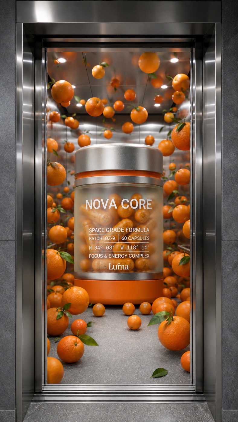
Identity · Packaging · Campaign film · Website · Social system
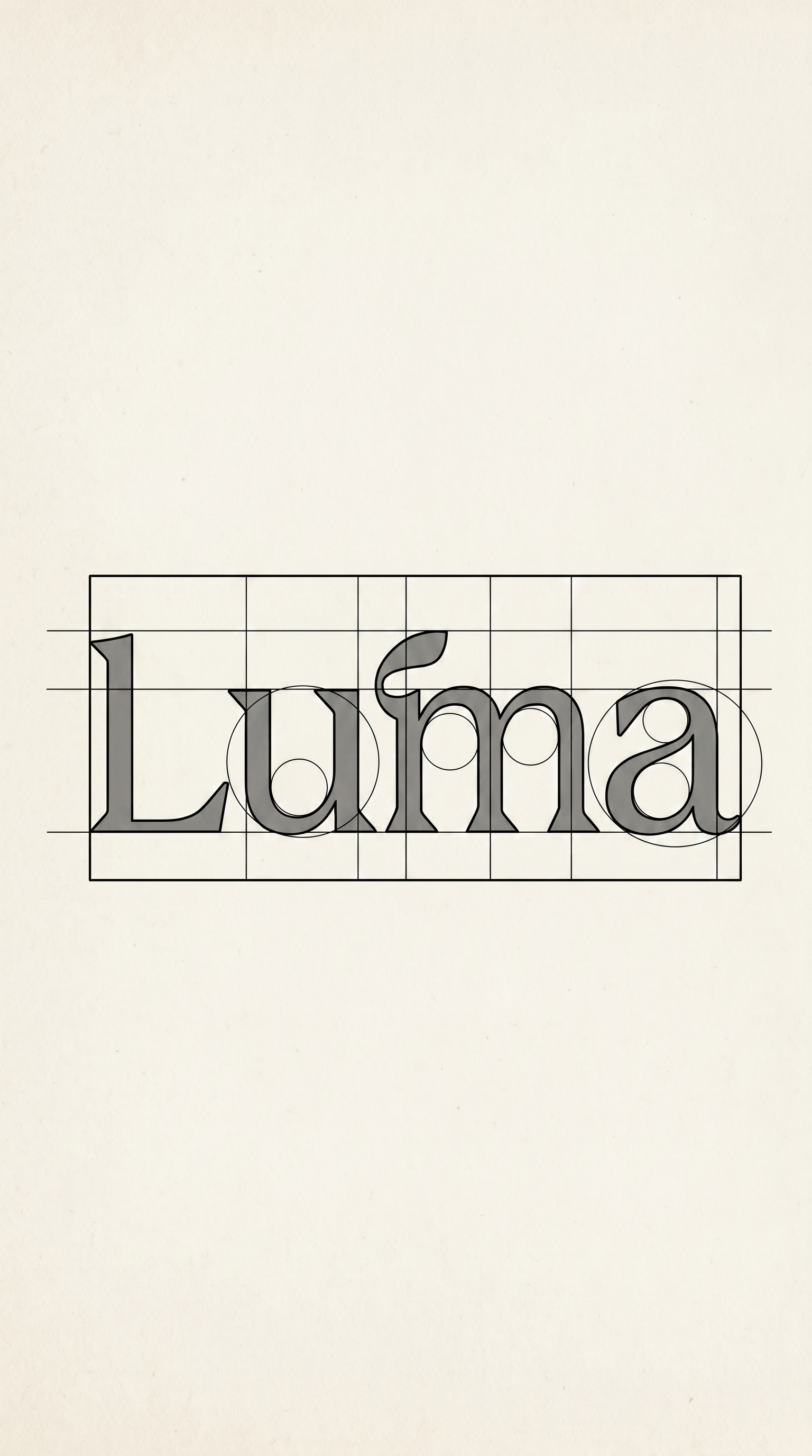
The leaf ligature over the "u" — stillness growing something. Construction grid, clearspace, and misuse rules ship in the toolkit.
Five tones, one temperature — evergreen calm carrying a single shot of citrus energy. Hover to hold a tone, click to copy its hex.
Focus, without the edge.
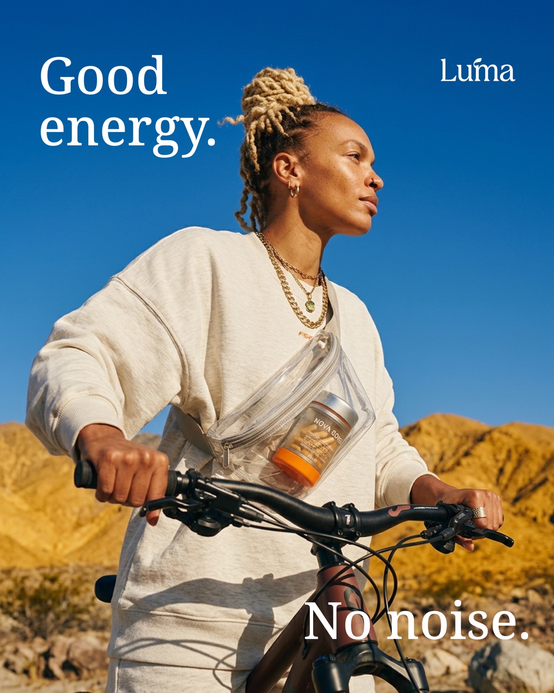
AaGood energy. No noise.
AaABCDEFGHIJKLMNOPQRSTUVWXYZ abcdefghijklmnopqrstuvwxyz 0123456789 &?!
Real mornings aren't smooth. The pattern library keeps every layout tactile.
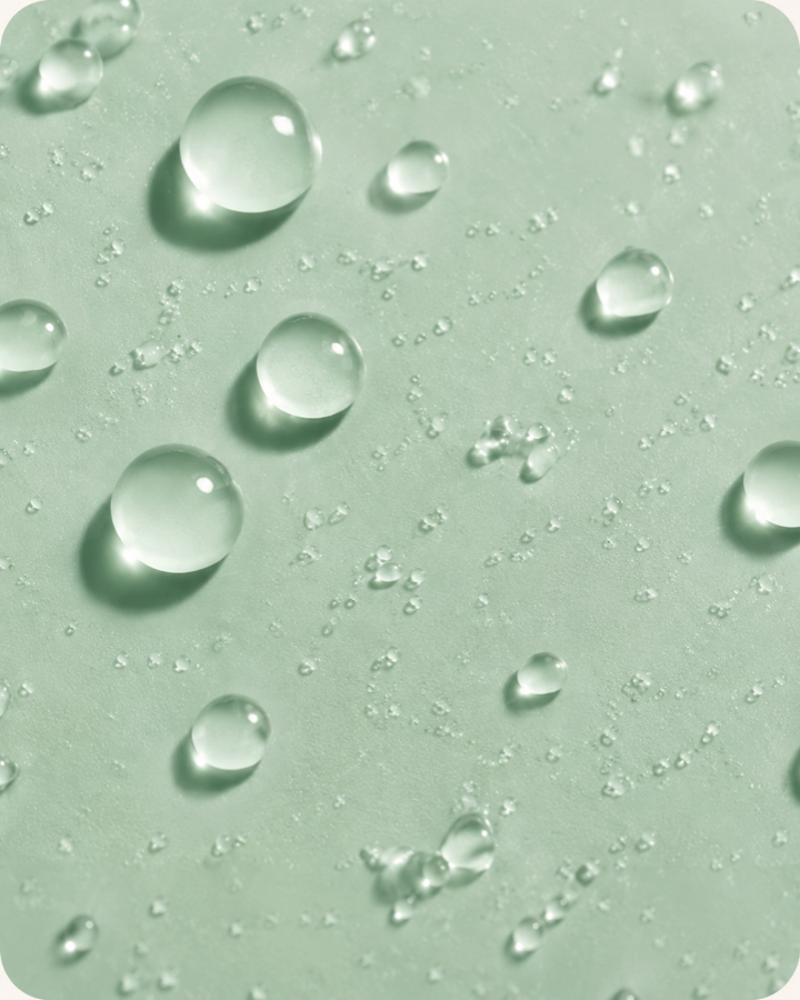
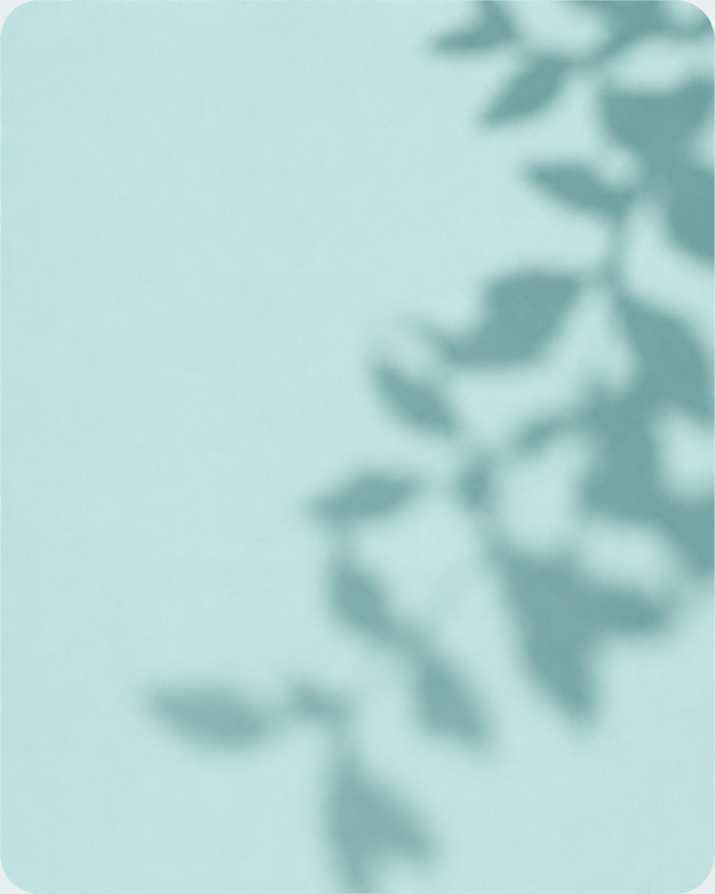
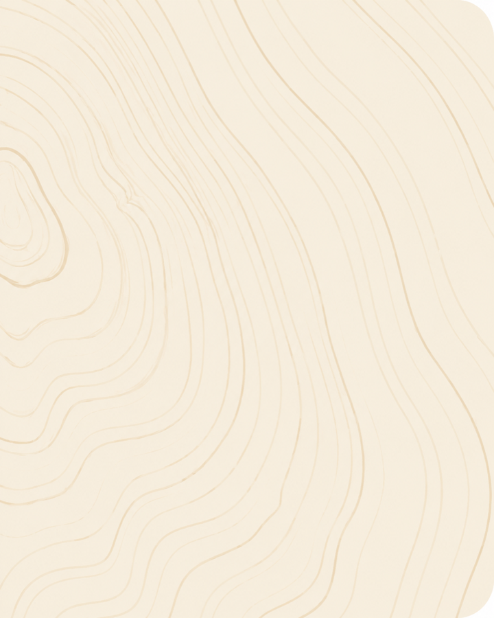
The brand's pace is a slow morning: product drifting in warm sun, nothing hurried. Every LUMA motion asset keeps this breeze — soft floats, gentle turns, light doing the work.
0:12 · 16:9 · breezeThe system holds at every scale — a card you can pocket, a billboard over the park, a poster on the platform.
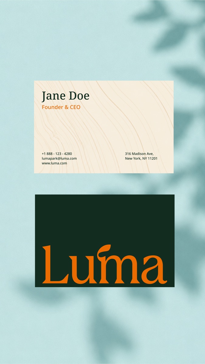
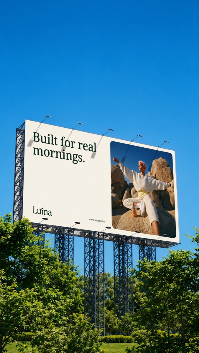
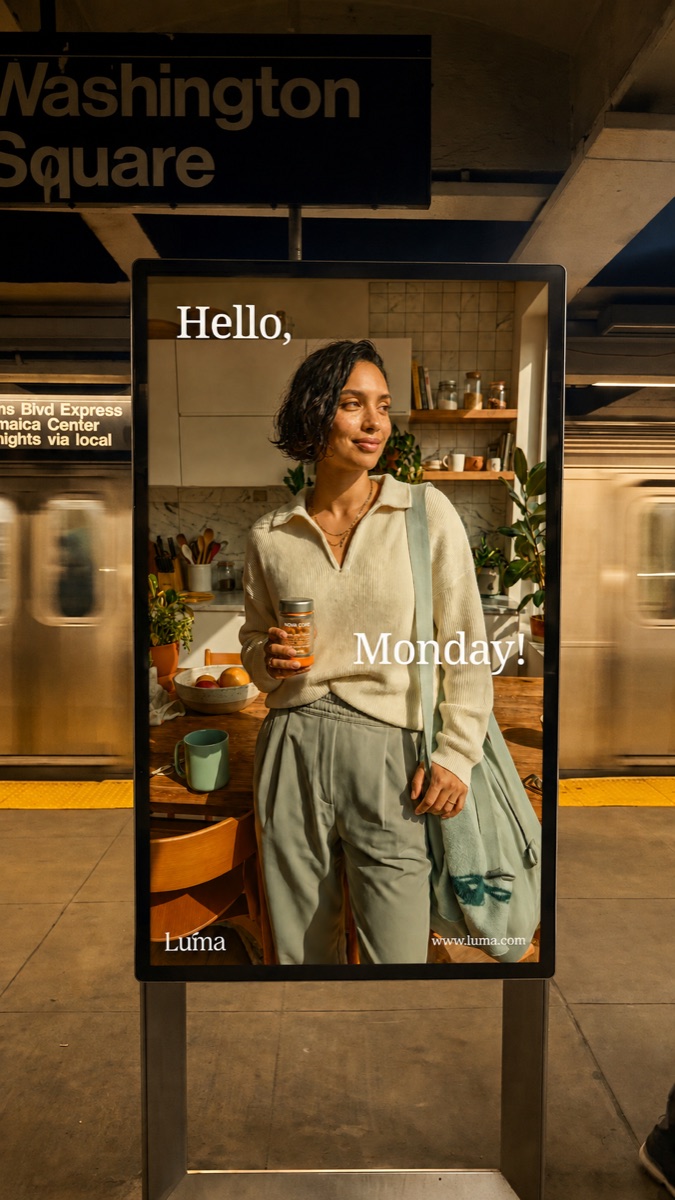
One launch film, three stills systems — real people, real light, editorial not staged.
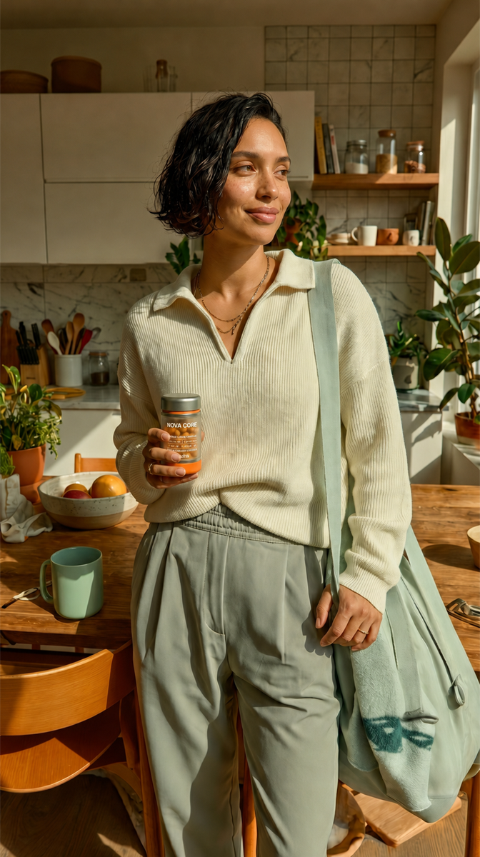


Cinematic scroll, product-first architecture, and the same texture language — designed and built end to end.
luma.com — homepage, desktop
One texture language, from the first scroll to checkout — designed and built inside the studio.
Platform-native templates and short-form motion — a month of feed, cut from one shoot.